I'm sure a lot of new business owners and armchair capitalists have had moments of sticker shock when they contact a professional about creating a custom logo.
After all, logos are simple and clean and small, and don't require a lot of colors or words. So, why is it so expensive to have one made?
Well, if you really think about it, the simplest things are the hardest to make.
Sure, I can come up with a range of colors that work for your company. I can search the internet for different photographs and decorations that complement your business. I can even suggest shapes and fonts really quickly. A good writer can easily brainstorm a list of words and phrases that would fit well with a company's philosophy or mission statement.
But a logo is just one image, with (probably) just one font, and just a few colors.
So, how do I begin to boil down an entire company – including its image, its philosophy, its attitude, its mission – into one thing?
Sounds daunting. It is.
Because every logo designer is really being asked to create a visual representation of a company's brand within a single, simple image.
First, I have to understand the company. What it is, where it will be, how it operates, who its customer is, what words it speaks, who its competitors are, and how it can be the best company possible. As heavy as this sounds, the good designer must comprehend it all, and then start translating that comprehension into visual components.
Everyone starts differently. Even my method can vary from project to project.
Maybe I will sketch or doodle or do internet searches or pinterest dives or revisitations of favorite design publications, just to get my brain going at full speed, and to see every possible thing there is. Some ideas stick to the wall, but most will be flung away.
Then I pick a few ideas and fully explore them. I've made hundreds of hideous and embarrassing sketches during this process, both on paper, and using a program like Illustrator or Photoshop. While ideas start with the grandest of intentions, most quickly turn to crap.
"That negative space between these two letters can't be made to look like a bird!"
"Why did I think a bridge viewed from below could look like the letter R?"
"I'm trying to make an icon for heat, and it keeps looking like freaking bacon!"
Here are some ugly failures that began my quest to create a logo for the New Hampshire Seacoast Area Libraries.
I'll show you in part two how these sketches ended up helping me, because I had my brain fully open to a lot of different possibilities.
Saturday, January 31, 2015
Thursday, January 22, 2015
Experiments in Bokeh
Huh? What is "bokeh"? An ancient form of Korean stick fighting?
Well, no. It's actually something you've seen a million times. You just didn't know the word for it.
"Bokeh" comes from the Japanese term for "blur" or "haze" and means the aesthetic quality of out-of-focus points of light as rendered by a lens.
Here's a fine example.
Well, no. It's actually something you've seen a million times. You just didn't know the word for it.
"Bokeh" comes from the Japanese term for "blur" or "haze" and means the aesthetic quality of out-of-focus points of light as rendered by a lens.
Here's a fine example.
Pretty cool, if it's done right. And it's a nice trick to add to your photographic arsenal, when used with discretion. And to be honest, it happens a lot by accident, too. Like when the sun beams through background foliage. Kind of like the sunshine doing a photobomb.
I was ready to publish this post, but held off for no good reason. The next day, I found (and purchased) a tiny string of lights powered by batteries. Here it is with a cute Christmas ornament.
Friday, January 16, 2015
New Year, New Calendar
Well, it's been 2015 for a couple weeks, and you probably have a new calendar on your wall by now. If not, I humbly remind you to acquire and hang one.
My great project last year, aside from setting up a new business, attending meetings of several creative groups, creating a logo, getting business cards made, building a website, and joining several social media outlets, was to actually PRODUCE something as a new business entity. Just a single product. And though I'm proud of it, I don't expect it to make me any money.
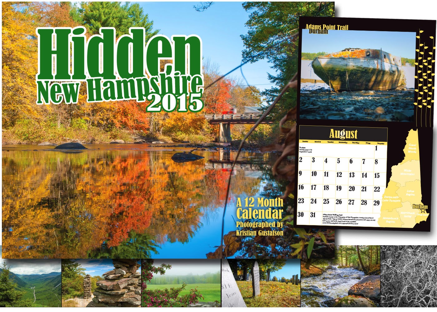
This is my calendar for 2015, and it is a celebration of the state of New Hampshire. It is also a celebration of travel, discovery, the unusual, spontaneity, and mostly, the beautiful.

My hope is that this first product will be the foundation of something larger - a brand of its own. Plans are underway to produce and sell a calendar for 2016. A bigger and better calendar. I hope they come to represent a friendship between New Hampshire's travelers and the scenic and wonderful places found tucked in every corner of the state.
My great project last year, aside from setting up a new business, attending meetings of several creative groups, creating a logo, getting business cards made, building a website, and joining several social media outlets, was to actually PRODUCE something as a new business entity. Just a single product. And though I'm proud of it, I don't expect it to make me any money.
This is my calendar for 2015, and it is a celebration of the state of New Hampshire. It is also a celebration of travel, discovery, the unusual, spontaneity, and mostly, the beautiful.

My hope is that this first product will be the foundation of something larger - a brand of its own. Plans are underway to produce and sell a calendar for 2016. A bigger and better calendar. I hope they come to represent a friendship between New Hampshire's travelers and the scenic and wonderful places found tucked in every corner of the state.
Sunday, January 11, 2015
Photo Bugaboos
I'm trying to keep my posts abut specific projects and photo assignments. If you learn something about how I navigate through various obstacles and challenges, it's supposed to help convince you that I'm a genius that you can trust with your own projects.
Or something like that. Except that it's the quiet time of year and I haven't had to solve too many problems lately. But I am always working on my photography.
As my photo selling site rounds into shape, I've been revisiting everything I have worthy of selling. And on the way, also seeing the photos I took that aren't worthy of lining your birdcage.
Every photographer makes lots of boo boos - images that are out of focus, blurry, too dark, too light, have the subject in the wrong place, etc. But then there are other images that ought to be good, but for some reason aren't. I can't quite get them to look exactly right, no matter how I crop them or adjust them. Those are my nemeses. The photo bugaboos.
But maybe I'm getting close to my 10,000 hours of diligence, because, by gum, I've dragged a few of those bugaboos back into shape, where they don't embarrass or haunt me any more.
I'm going to go ahead and say I'm proud of myself for "re-seeing" these photos and finally revealing the beauty I'd known was there all along.
I wish I could tell you there's a formula for this. But I think they are mysterious as my muse. The formulas you use work on most photos, but not all. Sometimes you have to take a leap of faith and break the rules. And sometimes, you have to come at these photos with fresh perspectives, to focus on what others will see, instead of what you want to see. And it helps to know Photoshop or Lightroom inside and out, so you can use an adjustment that you normally wouldn't even attempt.
I wish I could tell you there's a formula for this. But I think they are mysterious as my muse. The formulas you use work on most photos, but not all. Sometimes you have to take a leap of faith and break the rules. And sometimes, you have to come at these photos with fresh perspectives, to focus on what others will see, instead of what you want to see. And it helps to know Photoshop or Lightroom inside and out, so you can use an adjustment that you normally wouldn't even attempt.
Or you can tell me this photo is still crappy, and I'll go suck my thumb in a corner.
Tuesday, January 6, 2015
Buy my photos!
After some hair-pulling, lots of image re-manipulation. and a ton of uploading, my photography website is open for business. I went with Zenfolio for their competitive fees, multiple design options, and the insane amount of products available for purchase. However, I found in setting up my own personal galleries and site design that the user interface was probably implemented by a half-mad team of basement-dwelling engineers, but I figured it out eventually.
There are several galleries open, and more images will follow.
Link here http://designbykristiangustafson.zenfolio.com/
or go through my website at www.sitboaf.com
That's it. Buy my stuff!
Or just look and enjoy. Thank you.
There are several galleries open, and more images will follow.
Link here http://designbykristiangustafson.zenfolio.com/
or go through my website at www.sitboaf.com
That's it. Buy my stuff!
Or just look and enjoy. Thank you.
Monday, January 5, 2015
What's that stuff in a museum?
It's not a trick question. One goes to a museum to see what?
Art.
But "art" is a very broad term, and in the context of a museum, it becomes even broader.
Usually, when we think of the word, we think of artists making paintings and sculptures and photography - things that are meant to be beautiful. And possibly thought-provoking, emotionally evocative, challenging, etc.
But the things that reside in a museum, while usually "beautiful," were often not created for beauty's sake.
The impetus for this blog post, and for me thinking of art as something else entirely came recently when I visited the Virginia Museum of Fine Arts to see the extraordinary Forbidden City collection. Which, by the way…wow.
But I saw a lot of things that day in the various wings. And it occurred to me how few of them had been created only to be beautiful. How a lot of the pieces were barely "art" at all.
There were commissioned portraits, important for social standing and family legacy. There were bowls and blankets created with a bit of extra care for important functions in the home. There were religious artifacts meant to convey enduring symbology. There were musical instruments. Furniture. Shoes. Dresses.
Some of the items in the museum were mind-blowing or thought-provoking just because they were so darn old. I saw a big blanket made entirely of feathers that was 1,400 years old. How does that even survive?
It goes without saying that for a modern "artist" like myself, it is both humbling and inspiring to see so many kinds of items that touch you in so many different ways. I had to put my personal Muse on alert. I'm coming for her.
And I also wondered what the heck I'm doing making logos and photographs. Well, I need to make a living, so it's easy to understand insofar as they are part of my commercial enterprise. Commercial art is a whole other ball of wax, of course. One that's a relatively recent invention and easy for us to understand.
Maybe in the future, some curator will look past the vulgar reality of my "artwork," created in large part to make money, and decide to stick one of my photos in her museum.
Subscribe to:
Posts (Atom)


