Tuesday, September 1, 2015

No More Excuses. Period!

Part of the graphic designer's job is making sure everything makes sense. Not just with illustrations, photos and text boxes, but everything else, too. After the detail-oriented technical work on images and typefaces comes… well, the detail-oriented holistic approach – to make sure the client's vision is being executed properly. Otherwise, you may have a hodgepodge of correctly-colored items somewhere on a page near paragraphs of perfectly-leaded type.

Visual acuity, or a designer's aesthetic is crucial, but so is the understanding of language. And unless you're an expert on all your clients' stuff, that means dealing with writers. And THAT means knowing your editing symbols and correction marks. And THAT means you have to trust they know what they're doing. But they don't always. It's better to understand some things yourself. Just in case.

I'm here to save you. Here's (almost) everything you need to know about punctuation, all in one place: The 69 Rules of Punctuation. Available for purchase as a big poster!


Warning: if you geek out on this, you are probably a designer or a writer.
Or someone who appreciates good writing and design.
Bless you.

Thursday, August 20, 2015

The Conundrum of the Vacation Photographer

I just got back from a fabulous trip to Rio de Janeiro. My family and I had time to absorb the culture, and squeeze in almost all the things you're "supposed" to do while you're there, too. Of course, I brought my camera, my two favorite lenses (and, wishfully thinking, even my compact tripod).

But when you're whisking from one sight to another with your family, amongst throngs of tourists and their anti-social selfie sticks (grrr!), the last thing you want to be doing is checking every last angle for that perfect shot, and holding up the group to glean one more shot requiring complex manual camera settings. I feel guilty just getting my fair share, especially if the sun is beating down, my group is ready for lunch, or the crowds are maddening.

Cristo Redentor

To expedite my picture-taking and reduce frustration time, I made one crucial decision early on my trip and I stuck with it: Since the sky was going to be cloudless nearly every day, I didn't dawdle with many manual settings; I used Shutter Speed priority mode (set to 1/160th sec. or quicker) almost exclusively, and let the aperture open as it would. There would be enough light to get a super-fast, in-focus shot almost every time.

But, when I finally dive into Adobe Lightroom to check my hundreds of shots, I'm sure they won't be all I hoped they'd be. But, the justifications for sub-perfection are easily understood and provide me with some comfort:

1. The sun is at a crappy angle from mid-morning to mid-afternoon, when I would be taking all my shots, and a postcard-beauty photo would have to suffice. No tour guide is going to get me a special entry to Christ the Redeemer at sunrise for a magical golden-hour shot with no tourists around.

2. I didn't make my family wait around while I indulged in inventive shot-taking. Well, OK, I did. But just a couple times for a couple minutes.

3. I was there to have fun and experience a new culture. It's harder to do that from behind a viewfinder. And it's less fun than seeing something new while holding hands with your wife.

Ipanema Beach

Tuesday, July 28, 2015

Outdoor Art Show Success! (Mostly)

Well, it was a fun and interesting weekend in Gilford, New Hampshire, where I distributed my wares at the Gunstock Weekend Craft Village. There were about 25 vendors there, along with Segway-ers, hikers and tourists of varying levels of zaniness throwing themselves up and down mountains via slides and suspended cables.

If you were outside at all, you know that the weather was not the best. But it also wasn't the worst. Moisture was limited to a minor inconvenience, and there weren't any strong winds which might ruin peoples' tents and wares. I met some nice folks: customers, of course, but also vendors who had a few too many quiet minutes available due to the spare attendance. Many of them were very disappointed with the crowds. Perhaps I'll look back after a few shows and realize how lackluster it was, but…

My goal was to make my money back, plus a bit more, to justify the time and effort it takes to do such a show. Mission accomplished. Though I didn't get rich, I at least put a good chunk of change in my pocket, and moved some metal prints, which I had trouble with last time.


Lessons learned from my first outdoor show:

• Without doubt, the outdoor summer crowd is different from the indoor spring/fall crowd. Pretty is pretty, so I didn't move a completely different set of images, but I did move different media. The Summer people spent more on average, and were less interested in the very lowest-priced items.

• The tent worked perfectly, especially since I had practiced putting it up and taking it down a couple of times. I had a set of weight bags in place, but need to have my second weight set ready for more blustery days.

• Big magnets sell! I was pleasantly surprised that my new addition was well-received.

• Vacationers like to buy images of places they've recently been. It's not exactly my forte, but it certainly would pay off to have, in addition to my Hidden NH images, photos of spots that the customers had just hiked and visited.

• Metal prints get a lot more attention when they are set off the wall and people can see how thin they are. I did well by adding a 1 inch backer to my metals, though they were a bit wobbly in a breeze. I need to order all future metals with a backer already affixed.

• I need a bigger car or a cargo carrier. It's nice to have a sibling whose house serves as a base of operations for the Lakes region, but I need more universal solution so I can say "yes" to any nearby fair.

I feel great about meeting more people, learning more lessons, and doing better than breaking even. Let's see if I can get into a couple late-season/autumn shows in 2015. I hope to see you all there!

Tuesday, July 21, 2015

Brave New World (again)

I've been away from my blog for too long.

At least it's because I've been busy. I've been doing some freelancing and a lot (A LOT) of work on the Hidden New Hampshire Calendar for 2016. It's going to be awesome and full of nice touches. More on that later.

The other item that's clogging my workdays lately is getting ready for my second craft fair. And this will be my first time outdoors.

If you're in the area (or even if you're not), come visit Gunstock Resort in Gilford, NH this weekend from 10-4, for the Weekend Craft Village.

Free Admission! Music! Crafts! Mountains! Lakes! Weather!

My tent is purchased (a very nice EZ Up model that came with zippered sides included), supplies are restocked, and my metal prints have been given a one-inch foam backer to pop them off the walls. I'm very much looking forward to selling my stuff again. And I will be more so after I practice setting up my tent one more time in the backyard.


I only wish I my calendars were ready. Next year, I'll get them done a bit sooner, in time for the heavy craft fair season, which seems to kick off around Independence Day. But I do have a new item for this show - magnets! Let's see how they do.

I hope to see you there!

Thursday, June 11, 2015

Do I like this photo?

I'm not sure exactly what it is about this image. Why do I keep coming back to it? Why am I still changing it? Is it even flawed? Yes, it is, but I can't seem to put my finger on the problem in order to fix it.


Obviously, when I took this photo back in 2010 during my trip to Amarante, Portugal, I saw something worth capturing. Something besides the town's interestingly-shaped cakes (careful). There was a lovely wall. The water was still and reflective. Nearby was the hustle of the city market and the solemnity of the town church, yet here was a solitary man doing some quiet fishing down by the river – the simple pastime of a normal man.

And I keep getting sucked into that stone stairway on the right side that I can't make sense of, even five years later. How are those steps part of the wall? Why does their orientation look backwards? Why does the reflection look more correct? Shouldn't reflections look wrong?

I saw this photo upside-down today, (this is a handy trick for evaluating one's own work with fresh eyes) and noticed something new: the converging lines on the right side of the photo caused by the stairs, shoreline, and tree. I added a little contrast to the area to make it more noticeable and liked how that looked, but it gave the photo a secondary focus away from the man.

And maybe that's the biggest issue with this photograph – there is no proper focal point. Not that you have to follow every photographer's rule each and every time, but you need a good reason to stray away from normal. So, rules be darned; I'm choosing to compound my eye-confusion by showing selective color only in the fisherman's reflection. Umm, does that make it better?

Or am I just reflecting my own disorientation? Am I fishing for answers in an upside-down world?!?
Heh.

I'll just keep blaming those crazy stairs.

Tuesday, June 9, 2015

What is it about bridges?

There is something rustic and romantic about old bridges. I don't need to wax overly poetic about such things, as I did in my last post, but i'll just say they make wonderful calendar covers. I'll fight the urge to put another one on next year's edition.

New Hampshire has a lot of covered bridges, too. Not as many as Pennsylvania. One thing New Hampshire does have, though, is the last remaining covered railroad bridge in America. It's known as Sulphite Bridge and can be found in Franklin. Built in the last years of the 19th century and used until 1973, it was damaged by arson in 1980. It's also known as the "Upside-Down Covered Bridge," since the main deck of the bridge was not used for transportation. Instead, the trusses were covered for protection and a railroad track was built on the roof!

Winnipesaukee River Trail Association

The bridge crosses the Winnipesaukee river where a thriving paper mill stood decades ago. Thanks to a successful rail trail conversion, the bridge and remnants of the mill can now be found near Trestle View Park, along the beautiful Winnipesaukee River Trail.

Because of the dense vegetation along the river, photo opportunities are a bit hard to come by. That is, unless you're a tiny bit crazy, and are willing to risk life and limb (or a wet shoe) by climbing down embankments to whack some bushes and balance on slippery rocks.


And, I couldn't think of anything more fun to do on a gorgeous afternoon.

Wednesday, May 27, 2015

The noblest pleasure…

…is the joy of understanding."
– Leonardo Da Vinci

Sometimes artists are robbed of their own joy. They are unable to experience their art the same way their audience and customers will. While it's true there is a distinct joy to the creation of that art, and the work of many other fellow artists to enjoy, one's own art becomes both too personal – and too foreign – to appreciate properly.

Creating art is a bit like singing a song that everyone but you can hear.

In my own artistic niche of finding special locations that comprise Hidden New Hampshire, I am lucky – I discover these places for myself first. On a recent trip to the Dartmouth/Lake Sunapee Region, I stumbled across yet another concealed gem that my state seems to have in abundant supply.

Driving with eyes wide open north on route 3A through Bristol, Bridgewater and Hebron on my way to a few potential calendar outlets, I noticed a sign for "Sculptured Rocks State Park." Huh? Another place I'd never heard of? I stopped at my next destination and looked it up on my phone. I found a few fascinating images, but not much else. Exploring seemed like a wise idea!

I was not disappointed. After a short side trip into Groton, I found big, magnificent boulders carved into odd and fascinating shapes by the Cockermouth River as it rushed into Newfound Lake. It was a beautiful and almost jaw-dropping discovery. I clambered over boulders, snuck under branches and carefully hopped across river stones to attempt to bring photographic justice to this place.

"Water is the driving force of all nature."
– Leonardo Da Vinci


I'm not sure I had as much fun as the pack of college grads who were jumping into the chilly water to cool off, but discovering another hidden treasure in my home state gave me exactly the kind of thrill I hope to bring to others with my calendars, prints and cards.

Thursday, May 7, 2015

A better example of doing what I do

I scolded myself in an earlier post for not making the most of an opportunity when I should have.

I wanted to share a brief story of a more successful venture. Because it illustrates at least part of the life I imagine living in the near future. Certainly, my future plans will shift based on clients' needs, my success at craft fairs, and other things that the future tends not to reveal in detail.

Spring for photographers: the best of times, the worst of times.
Good: Flowers, sun, warm weather and those bright, shiny new leaves.
Really Good: Going on day trips with my wife to uncover beautiful spots throughout New Hampshire.
Bad: High, flat light from the sun for much of the day. Very early sunrises and very late sunsets. Rain.

No, I'm not going to get the best light for many of my photos, because I'm not going to wake up in the middle of the night, rouse my wife, travel some distance, then hope capture the golden light of sunrise (which might be clouded over anyway). I'm also not going to keep my wife out late, some distance from home, just to utilize the golden hour at sunset, either. Job one is visiting some locale which gets too little attention, to help celebrate this beautiful region. So I resign myself to compensating for that bright, flat light during post-production. If it means spending a very nice afternoon with my wife driving winding roads and seeing interesting things, I'm OK with that.

This time, I planned well, and we had a great afternoon.


The Old Carr bridge in Hillsboro

There are six stone bridges in the Monadnock Region of New Hampshire, some of which are still used for vehicular travel. This very handy website transformed a couple anecdotes that I'd heard into a feasible day trip. I carefully mapped a route that included a retail store I wanted to visit. When the afternoon was over, I had photographed all six stone bridges and may have added another home for my Hidden New Hampshire calendar (and other merchandise?) come Labor Day.

From all perspectives, it was a success. Spring is a great time to photograph streams and waterfalls because of the snowmelt, so I got some lovely and dramatic pictures, conducted some commerce, and had a nice time driving pretty roads with my wife.

Look for the stone bridges of western New Hampshire in the next Hidden New Hampshire calendar!

Monday, April 27, 2015

After the First Craft Fair: The Learning

Well, my stress level has gone down. My first big craft fair/art fair is done. All-in-all, it went pretty well, and I probably prepared about as well as I could have, given my inexperience. Now I have to learn my many lessons before preparing for the next one.

Aside: about that next one…I've been blessed with up to seven weeks of jury duty starting in mid-May, so I am unable to make any commitments to shows taking place before mid-July.

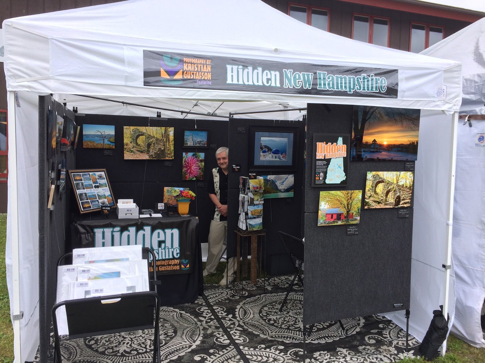
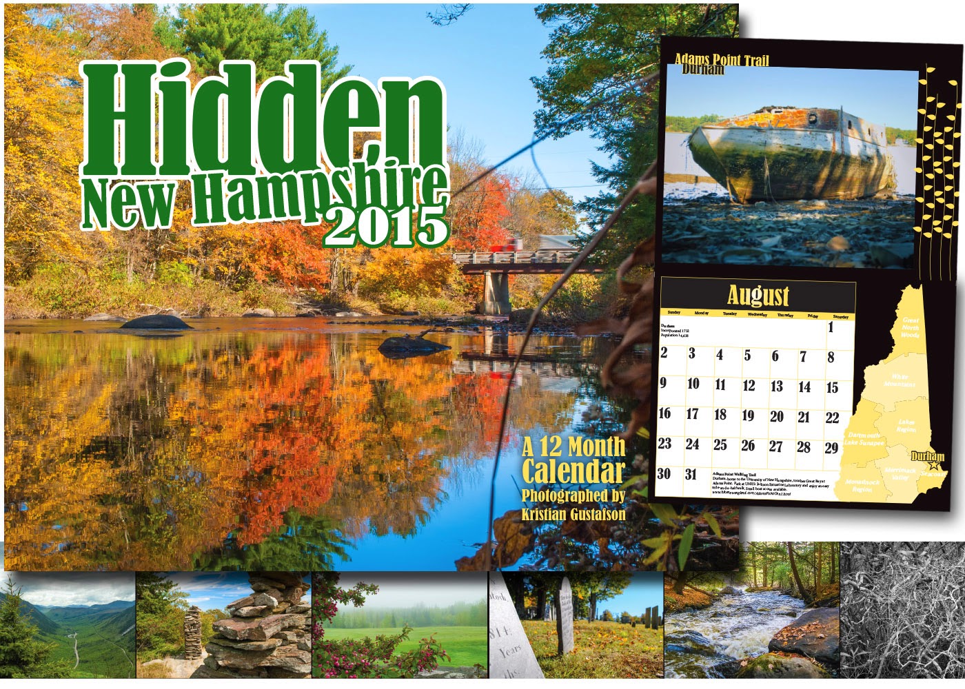
So, how did I do? Not too bad! My strategy was to suck people into my booth with a two-pronged attack: First, put a few of my best images on an aisle-facing wall, and the rest of my best stuff in large format on the back wall, which is what people see the most. Second, put my art bins right up front, to provide every shopper with that familiar experience of flipping through lots of matted images. I chose not to have a table filled with items, which is a tried-and-true tactic, but one that didn't suit me, as I had very few items that might work there. I instead used my table space for email sign-ups, business cards, brochures, free post cards and some decoration. I did sell my calendar and the smallest of my matted prints there. In the future I may find myself with lots of magnets and coasters, and my calendar will be prominently displayed, but I may opt for wall shelves instead of cluttering a table.

Once interested, I was hoping to provide easy-to-reach price points for the expected throng of shoppers who didn't have a ton of money. (I noticed another novice artist selling their items at gallery prices. It wouldn't take many sales to justify that strategy, but given the crowd at this particular event [generally moderate-spending locals and not freespending tourists], I wonder if it actually worked.) Volume rather than big ticket was my approach. And my biggest sellers were not a surprise: 5x7 and 8x10 prints, and notecards, especially my 3 for $10 deal. I only moved a couple of large units (both canvases), and just a few of my smallest 4x6 prints. My prints on aluminum… well, I'll get to that.

Other successes:
• I was very happy with my credit card reader, which worked perfectly.
• I had a squishy fatigue mat for the long hours of standing. I love that thing.
• I had shopping bags, business cards and brochures ready, and people appreciated them.
• I got about as much traction from my email sign-up sheet as I'd hoped (but PB, JM and SW, if you're reading this, you either print terribly, or my eyeballs are shot, but I really, really tried to figure out your email addresses! Shoot me a note and I will get you on there!).
• I handed out about 80 free postcards with a coupon code. We'll see if that leads to any sales.
• I put enough price stickers and tags on my works that almost no one had to ask what something cost.
• My rugs looked damn good.
• I got a lot of compliments on my work, even from people who had no intention of buying.
• I got to talk about a lot of my prints with curious shoppers (mostly, "where was that shot taken?," which I found fun). One woman even saw her house in one of my photos! (sale!).


And of course, there were some failures.
• The weather was too nice for an indoor show, and Saturday's turnout was abysmal. I was expecting traffic similar to last year, when it was mobbed, but this year's event was held too late in April, and people didn't want to shop indoors on the first beautiful Saturday after a harsh winter. I can't blame them. I'm sure there was a lot of lost revenue that many vendors weren't anticipating. I need to carefully consider the weather and venue for my next show.
• Without a developed strategy for arranging works on my walls (Should it be by similar colors? Shot location? Print medium? Dimensions?), I simply made my best stuff most prominent. Going forward, I think it's probably smartest to also separate the Hidden New Hampshire images from photos taken elsewhere in the world, as it confused some. They would see a photo of the White Mountains on one wall and Greece on another, and feel compelled to tell me "That's not in New Hampshire!" Yes, that's true, and I'm not trying to deceive anyone, and I am sorry (But my branding of Hidden New Hampshire was working!).
• A Hidden New Hampshire book (basically an expanded version of my previous calendar/s) would probably sell, so I need to find a way to create and publish them inexpensively.
• Too many people wanted to know where something was shot, but my labels only provided the name of the image and the price. I need to include locations going forward.
• I brought with me some extra images, mats and frames so I could replace prints that sold. Pipe dream. They took up too much space, and I had no time to make replacements. If I need to, I can replace one or two in the evenings after the show and avoid hauling all that stuff around.
• My presentation of the metal prints was inadequate. While shoppers may have been curious and impressed, they did not buy. Metals cost more than matted prints, but they also go home ready to hang without the extra expense of frames, glass and hanging hardware, bringing them closer to an equivalent price. I could have made that more clear to my customers. Also, the way I affixed the metals directly to my walls was unimpressive. Many metals are "float mounted" with a 1/2- to 1-inch thick backer that makes them appear to "float" off the wall. I can retrofit mine to do that. And if I back light a few with fairy lights, I will greatly increase the wow factor.

One shopper, an experienced photographer, came for a visit and spent a good 15 minutes critiquing each of my works. And by critiquing, I don't mean pointing out which photos he thought were good and which he thought were bad. He pointed out the flaws in EVERYTHING. But, since I have a thick skin, I stayed right with him all the way, discussing my works objectively and using our conversation as a learning experience.

One of many. And I loved it.

Monday, April 13, 2015

Are you the good stress or the bad stress?

It's been way too long since I posted a new blog entry. Sorry.

I've been consumed with getting ready for my first craft fair. Of course, I've been working very hard, not just getting stuff done that needs to get done, but designing, Actual, real life designing. Yes, I've ordered lots of photos, in paper, metal and canvas. But I've also had to create a booth. And a booth isn't just something that goes into a space I've paid for. I'm way beyond a sign and some tables.

I've put deep thought (and deeeeeep internet searching) into my table, walls, rugs, art bins, signs, price tags, giveaways, bags, brochures, and all the way down to the kind of pens I'll be using. As a creator and builder of brands, I'm creating a brand new brand – for me. Design by Kristian Gustafson will have a physical manifestation as a seller of photography. I'm pretty sure I'm not allowed to screw this up.

Somewhat cleverly, I've now utilized my company's alternate brand mark for my photo business. Not so cleverly, it's called "Photography by Kristian Gustafson."


But I'll also be hammering on what will become the real brand. Not me, nor my unwieldy name, nor some silly tiki symbol. The phrase "Hidden New Hampshire" will be very prevalent in my little booth, because that idea has legs. I think it has a chance to be remembered, show after show, by the "craft fair crowd". Also, I am quite aware how difficult it probably is for folks to recall my actual name.

So, despite all the coordination, planning, and shopping (!) that has gone into my product, booth and brand creation, I'm still feeling pretty good. Of course, for all my preparation, I sure as heck can't anticipate what I will have done poorly (or well), when my first show ends and I reflect back. My motivation is keeping me searching for the perfect approach, which of course, I cannot achieve. As a wise friend of mine once said after a new venture, "We didn't know what we didn't know."

Also, did you know there are two "stresses?"
There's distress, of course. But, also its happy brother eustress.
Eustress is the good stress that motivates you to continue working. Stress can be a motivater and provide incentive to get the job done. This "good stress" is what eustress can be identified as and some people enjoy it. Everyone needs a little bit of stress in their life in order to continue to be happy, motivated, challenged and productive.
(from Brock University's website) 
See you here later for the post-mortem!

Tuesday, March 24, 2015

A Brave New World…of Handmade Cutting Boards

I'm about to embark on a great new adventure in my professional life. It's been about a year since I started my business, and this dream came along with it, but I didn't have all my stuff together during calendar year 2014 to pull it off. Seeing all the work I've been putting into it for 2015, there's no way I could have managed it before now, anyhow.
What the heck am I talking about? Why "handmade cutting boards?"

Craft Fairs.
You've all been to them, probably many times. Often spur-of-the-moment or by whim. Some are themed, and some are part of larger assemblies of people. But you're all familiar with the small booths and tents set up with scented soaps, organic dog treats, homemade jewelry and… photography. There's always photography.


And so I venture into the 2015 craft season with my own stack of lovely photos to sell to folks. I'm not sure how many items I will be able to sell. Nor am I sure how many shows I will do before things wind down in the fall. Or which shows will be best suited for me. The interrelationship of these factors will become more apparent as the year goes by.

I DO know I'll start to figure it out while at the enormous NH Made show in Manchester, NH this April 17-19.

It's a very good thing that I'm excited about it, because it's uncertain whether this business model and I are compatible, and it's a tremendous amount of work to get up and running. But, my enthusiasm keeps me confident of financial success and keeps me pushing through the huge to-do list I have. I'm not complaining. Some folks need to ship truckloads of stuff, arrange for people to unload them, hire helpers, pay for electricity, pay for internet. and then actually have to sweat and toil the whole time they're there, cooking things and doing demonstrations. I have it easy. I'll be sitting on my stool, being charming and answering questions, while my photos hang on my walls doing the heavy lifting for me.

Still, the amount of things I had to tackle has added up to a mountain. Thanks to Bob Estrin for his handy guide!

I didn't have a mobile selling space. That meant buying ready-to-assemble walls, bins, tables, and a rug. And getting it all decked out with signage that I'm designing.

I didn't have a way to take peoples' money. That meant I had to sign up with a mobile card-reading service, like Square or Amazon Local Register and connecting it to my bank.

I didn't have a selling strategy or list of prices. That meant doing a lot of pricing research and creating a spreadsheet containing every single cost for every single product, in hopes that my efforts will be properly rewarded.

I did have a photography website set up, and they have a preferred printer. Still, that meant revisiting all 50+ images I hope to sell, re-cropping them to fit standard sizes, and painstakingly re-adjusting each one to my printer's preferences using a color profile, so that I'll know (more-or-less) that my prints will come out looking as I expect them to.

Lastly, I didn't have a gigantic pile of images to sell. That meant paying for several small prints of each image, and then again in both medium and large sizes. And buying hundreds of bags and cardboard mats. Being signed up with several printing outlets and hawkishly coupon-watching has kept my costs way down. And that means affordable prints, for you, dear customers.

Some of these many costs won't have to be repeated, as I will re-order things that sell and re-use my booth hardware (until I need a tent for outdoor shows, that is!)

So look for me in the brave new world of kitten outfits, soy candles, water purification systems, and the teak cheese boards. And treat yourself to a lovely photograph while you're there.

Friday, March 13, 2015

An efficient trip to the mountains

I'm very lucky that I have a wise and patient wife. I seem bent on combining my business trips with our pleasure trips. We had a nice stay at a favorite bed & breakfast, got to see the beautiful White Mountains of New Hampshire, ate some great food, and had a fabulous day of cross-country skiing.  All good.

But I had a short list of things I wanted to photograph. Oh, and two retail stores to check out. Also, a couple owners to meet. Somehow, I managed to do all that while keeping my wife entertained. The retail part of the trip went just fine. I've been scouting many brick-and-mortar stores throughout New Hampshire that might be interested in selling my Hidden New Hampshire calendar for 2016. Every time I wander more than a few miles from my home, I've got my list of stores handy so I can kill at least two birds with one chunk of Granite.

So far, the responses I've gotten have mostly been very positive. It's been fun meeting business owners like me who love New Hampshire and want to celebrate it. Thankfully, I'm now confident enough showing my photographs to them that I can ask them to carry my product. Some are really good photographers themselves, which is usually helpful, but sometimes intimidating.

Of course, any trip to the White Mountains would be a waste if I didn't have my camera ready to capture some cool, lesser-known spots. It was beautiful out the day we wandered around, so getting a good view of Cathedral Ledge wasn't too hard. The ice-climbers made me nervous, though. Props!


Diana's Baths is a fabulous place to wander around the other three seasons of the year, but Winter at the Baths was rather magical, too. Not just for the frozen waterfalls and pools, but the sounds of mountain streams rushing under them all, too.


Traveling the nearly-famous Kancamagus Highway was less successful, though. Many of the scenic overlooks and pull-offs are not maintained between Fall and Spring and were therefore inaccessible. We did stop at one view, where I plopped down in the snow for a good angle of the mountains to the north, but the light was high and flat, and the experience of being there wasn't going to translate well into a 2-D image. Granted, the other tourists had a better time than I did, seeing a lunatic laying on a windy, snow-covered hillside to take a few pictures.

There's lots to see and explore on "The Kanc" in Winter, but my wife and I were not keen on spending a lot of time there. We had forgotten our snowshoes, and needed to travel a while longer to find much-needed lunches. So I was hoping serendipity would strike the few times we hopped out of the car. It did not.

Still, it was a great trip from all accounts. I should endeavor to be so efficient for the rest of my trips into the far corners of this great state.

Sunday, March 8, 2015

When humans couldn't see blue

I recently read an extremely interesting article about the perception of color. Of course, I was drawn in by the title, "No one could see the color blue until modern times." What??
But really interesting things about humanity's past were revealed, as relating to language and perception. It struck me that this subject related to my profession, as well. Actually, it relates to everyone's profession, and proficiency in general. And what it means to be an expert.

If you don't have time right now to read this very interesting article by Kevin Loria, I can use some quotes to sum up before moving on.

Until relatively recently in human history, "blue" didn't exist, not in the way we think of it.
…ancient languages didn't have a word for blue — not Greek, not Chinese, not Japanese, not Hebrew. And without a word for the color, there is evidence that they may not have seen it at all.
The only ancient culture to develop a word for blue was the Egyptians — and as it happens, they were also the only culture that had a way to produce a blue dye. 
So before we had a word for it, did people not naturally see blue? 
…without a word for a color, without a way of identifying it as different, it is much harder for us to notice what is unique about it — even though our eyes are physically seeing… it in the same way. 
So before blue became a common concept, maybe humans saw it. But it seems they did not know they were seeing it.
If you see something yet can't see it, does it exist? 

There's even a physical test included in the article that perfectly demonstrates that when people use different sets of tools (words), some won't see a simple distinction that you and I easily make every day – and vice versa! At first, I thought I was staring at eleven blocks of identical green, until the author asked me to pick out the one that was different! It took me a few moments, but I was able to. I imagine some of you would not.

The vast majority of people can name every color in a box of 8, 16 and maybe even 24 crayons. But do you know what mauve is? Or chartreuse? You can probably "see" them, as the ancients "saw" blue, but either cannot distinguish them from their neighbors purple and green, or must resort to using extra modifiers like "dull-" or "bright-."

Did you know that Brazilians, with a populace comprised of every shade of human being, make no fewer than 14 racial distinctions? It's just something they think about a lot more than we do.

Which brings me to the professions in the visual arts – designer, decorator, photographer, artist. Yes, we see blue. But we're also SO used to seeing blue in all its varying shades that we probably make more distinctions than the average person can. Can you imagine an interior decorator who accidentally reupholstered your sectional to match sky blue instead of navy blue? It wouldn't happen because people in visual professions have the language, the words, and the mindsets to deal with appropriate subtleties and complexities.

Here's a color test I took to determine my own color acuity. My eyes almost fell out of my head, but I'm happy to say I scored (low being good) a 3 out of 99. How will you do?

I humbly ask that you respect an artist who might criticize a photo as being blurry, out-of-focus, grainy, low in contrast, undersaturated, overcooked, jaggy, banded or blown out, while you only saw "not so good." 

And I promise to defer to your own expertise, in kind.

Friday, February 27, 2015

Being a Professional Photographer. Kind Of.

I certainly take enough photographs to call myself a photographer. I even sell some photographs, which technically makes me a professional photographer. But that doesn't describe what I do very well.
I'm not a wedding or event photographer, because I don't have the desire, the open weekends, the battle-training or nearly enough equipment.
I'm not a studio or model photographer, because I don't have my own space, or nearly enough equipment.
I'm not a travel photographer, because I don't get sent on trips to take photos, and I certainly couldn't make enough money to pay for my next trip by selling pics of my previous trip. I might not have nearly enough equipment.
I don't do wildlife or extreme-nature photography. Those guys are absolute rock stars, camping on snowy ledges overnight to capture rarely-seen animals or sunrises over volcanos. Also, I don't have nearly enough equipment.


I suppose what I am is a glorified amateur photographer with a little bit of equipment, an above-average travel schedule, and a lot of tenacity when it comes to finding a way to make a living doing something I enjoy.
I'm far from being rich, well-known, or even financially comfortable, but I intend to try like hell, because there's enough I love about this profession that makes me want to actually succeed and become a true professional.

So, while I continue to claw and scratch at the other part of my job – my REAL job of graphic design, I keep on taking photos, using some advantages that few other "semi-professional" photographers have.

My strengths:
• I get to travel quite often, thanks to certain older relatives who have retired and moved South, and thanks to my awesome spouse, who gets invited to conferences all over the globe.
• I see things that other photographers do not see. I'm not exactly sure why this is, but I suspect it has to do with my later-in-life arrival to the photographic world, my advertising and retail experience, and my 20-year career as a graphic designer. I've got to capture what others have missed, because (as I have made clear above) I have neither the time, equipment, nor financial resources to get a better picture of the Eiffel Tower at sunset than everyone else. But I might – just might– get one unique and wonderful picture.
• I will crawl up a hill or lay down in the sand if I suspect I can capture a cool angle.
• I have a deep focus for post-processing my images. To an outsider, I might appear to be a crazy person who stays up too late, re-cropping and re-exposing photos to get them just right, using every tool available in Adobe Lightroom, while listening to Pink Floyd and drooling a little.
• I've got just enough self-loathing to admire my own work very briefly, before calling myself a hack and vowing to get better at what I do. I talk to other photographers, read articles, watch how-to videos, and experiment with technique. Not as much as I should, but a whole lot. But also, not enough.

If you're interested enough to buy one of my photos, either via my calendar, my website, or at a craft fair, I thank you most sincerely.
But I also promise to keep my fire stoked and show you better pictures the next time.

Sunday, February 15, 2015

Photo Safari to Hancock, NH

I recently made a same-day decision to drive out to Hancock, NH, in order to capture some New England winter quaintness. If I want to keep creating my Hidden New Hampshire calendar year after year, I can't fill it with only summer and foliage shots. Not only because it would get boring, but the 2016 calendar will go to print before the leaves turn.

The town itself is about 40 minutes away, so I packed my camera, tripod and snow pants and headed out on an afternoon that – somehow – wasn't windy, snowing, or insanely cold. It's been a rough month!

I'm trying not to beat myself up about the photographic results.

It was chillier than I'd hoped. Also, after a few minutes of wading through knee-high snow with equipment, my hardiness meter fell. I had hoped to last long enough to capture the glow of the setting sun on the town, but an enormous cloud bank put an end to those plans, and I just did a little exploring instead before heading out. The sun mocked me by coming out for a few more golden minutes when I was halfway home.

“Failing to prepare is preparing to fail.”
- John Wooden

Great quote. And I was guilty as charged. I didn't do more than glance at the weather forecast. I didn't have many backup targets in mind, after the meetinghouse. I should have had other locations scouted out beforehand. Even for a tiny place like Hancock, there are articles to read, images to google, online maps to virtually wander, and histories to consider. There's… well, it's work. And like everything else worth doing well, it can be tedious.


Still, goal number one was to capture the town meetinghouse in afternoon light, and I got some very good shots. In fact, I realized later, upon examining my images, that I had been very efficient with my camera settings, tripod handling, and decision-making, which tells me that I've clambered to an ever-so-slightly higher plateau of competency.

If we ever get a break from this weather, I'll be ready (darn ready!) to head to my next photo safari.

Sunday, February 8, 2015

Birth of a Logo, Part 3 (conclusion)

You can read about how a designer whittles massive amounts of information and input down to a few visual ideas in part one of this series. Part two deals with solidifying a few logo ideas for the client, and, when the feedback comes, the designer's crushing realization that he's not a genius after all.

After I was challenged to improve upon the first ideas I presented to the client, I needed to reassess where I was. This part of the process is not as simple as taking all of the client's criticism and implementing their ideas, because the client hasn't seen the million things I've tried and rejected along the way. Sometimes their "solution" goes right to a place I've already been. Once I hear what's not working, my brain starts racing with new directions and possibilities, and I have to tune out any well-meaning suggestions that may lead me around in a circle or back the way I came.

Also, design by committee rarely works well.

As I wrote in part two, the kernel of my idea got to stay - the profile of New Hampshire as a lighthouse. Everything else about this logo had to justify its existence.

"Dynamic. Modern. Community."
Those were the feelings missing from my first attempt. And that was all the fuel I needed to set off in a new direction.

Dynamic: does a library coalition need to convey physical movement? No, but my sturdy old lighthouse (an excellent metaphor for knowledge and enlightenment) also had to suggest flexibility, relevancy, and currency. Maybe I should add more well-placed lines to my lighthouse…

Modern: Fair enough. My first color palette of blue and white was pretty dull. What else might be too standard about what I presented? Maybe there were shapes that could take the viewer's eye on a more interesting (and less linear) journey…
Community: Was my design too sterile and unfriendly to suggest a neighborhood place where you'd enjoy going?

I added a more modern color to complement the "New Hampshire Blue" already in place. Then, I tried to create a new set of lines that would be more exciting to look at. Maybe I could add something for local flavor, too…


Okay, we have a second, more modern color to use with "New Hampshire Blue". We have a happy seagull! We have more interesting lines. But it felt like too much was going on. Is the seagull distracting? Is the lighthouse idea lost?


Here's a different approach, arrived at after another million scribbles. Can you see beams of light, books, and the letter "S," all at the same time? This is a triumph, but my old idea had vanished entirely. The colors still look nice together, but maybe that teal should be a hair brighter. And, instead of "books in space," I needed to marry the old idea to the new one.

What if one set of lines was the lighthouse beam, and the other became waves? After more wrangling and heartache, I finally created this:


Eureka! I see New Hampshire, a lighthouse, waves, book pages, an "S," a light beam and the ocean at the same time. It's not too busy or too staid. And, with a tiny bit more back-and-forth with the client, we added an open book masquerading as a door, adding an element of community friendliness.

I was proud to present this final idea to my client, who was nice enough to call it "flippin' awesome."

I'm happy to show off this piece as the result of hours of hard work, but also a lot of constructive communication. I give the client a lot of credit for knowing what they wanted, and for letting me figure out how to achieve it using my own vision and skill set.

Also, support your local library!

Wednesday, February 4, 2015

Birth of a Logo, Part 2 of 3

In part one, I described the complex and chaotic way that logo design is started, and the crushing weight of everything that goes into the process.

But amidst a jumble of half-cooked ideas, brilliant nuggets and outright failures, the designer eventually pulls things together. Shapes coalesce, colors sort themselves out, and visual balance starts to round out. Things start to get exciting. The chase is on.

Gross missteps and embarrassments still happen in this part of the process, but as solid ideas are honed in on, each miss is leading the designer closer to a hit, or – with hope – a home run.

The unappealing work I did at the start of the process for Seacoast Area Libraries (a bespectacled seal reading a book?) eventually morphed into something new, when I realized my manipulations of the New Hampshire state outline began to look like a lighthouse – a perfect symbol for the New England Seacoast.
Here, after much wrangling, are the results of combining those two ideas.

This one is "lighthouse-y" enough, but the outline of New Hampshire is too stylized and  almost impossible to pick out.
Here, the seacoast area profile is more understood, while the lighthouse image is still obvious. I put the seacoast area of New Hampshire next to a blue field representing the ocean, a helpful visual cue.

I was getting close.

After these initial ideas were sent to the client, the feedback was very positive. But one person remained unconvinced. She wrote: 
I feel like it is missing something... I would like the seacoast libraries to come across as dynamic & up-to-date, and I'm not sure that this logo does that. I am definitely not a graphic designer so I am very unqualified to suggest what might work better -- but maybe even something as simple as color or font?
Here are a few things that seem to be missing (as concepts):Movement, Color, Modern-ness, Font with more character - more life, Some nod to the importance of people (librarians! patrons!) & community
Ouch.
The pointedness of her comments proved she was indeed qualified.
As painful as it was to face rejection, I know I needed it in order to create my best work. I have learned over the years not only to accept constructive criticism, but to embrace it. And further, to find a substitute for it when no one is complaining. A friend, a message board or a group of peers become vital to the designer's progress. And if I can't find those things when convenient, I just criticize myself, as honestly as I can.

And in my heart of hearts, I knew she was right. I could do better. This criticism didn't discourage me; it motivated me. Show me a successful designer and I'll show you someone with thick skin and a resilient imagination.

So, I went back to the drawing board. The kernel of inspiration (the NH profile/Lighthouse idea) stayed, and everything else about this logo was fighting for its job.

In part three, I will kick things up a notch and produce a final logo for my client.

Saturday, January 31, 2015

Birth of a Logo, Part 1 of 3

I'm sure a lot of new business owners and armchair capitalists have had moments of sticker shock when they contact a professional about creating a custom logo.
After all, logos are simple and clean and small, and don't require a lot of colors or words. So, why is it so expensive to have one made?

Well, if you really think about it, the simplest things are the hardest to make.
Sure, I can come up with a range of colors that work for your company. I can search the internet for different photographs and decorations that complement your business. I can even suggest shapes and fonts really quickly. A good writer can easily brainstorm a list of words and phrases that would fit well with a company's philosophy or mission statement.

But a logo is just one image, with (probably) just one font, and just a few colors.
So, how do I begin to boil down an entire company – including its image, its philosophy, its attitude, its mission – into one thing?

Sounds daunting. It is.
Because every logo designer is really being asked to create a visual representation of a company's brand within a single, simple image.

First, I have to understand the company. What it is, where it will be, how it operates, who its customer is, what words it speaks, who its competitors are, and how it can be the best company possible. As heavy as this sounds, the good designer must comprehend it all, and then start translating that comprehension into visual components.

Everyone starts differently. Even my method can vary from project to project.
Maybe I will sketch or doodle or do internet searches or pinterest dives or revisitations of favorite design publications, just to get my brain going at full speed, and to see every possible thing there is. Some ideas stick to the wall, but most will be flung away.

Then I pick a few ideas and fully explore them. I've made hundreds of hideous and embarrassing sketches during this process, both on paper, and using a program like Illustrator or Photoshop. While ideas start with the grandest of intentions, most quickly turn to crap.

"That negative space between these two letters can't be made to look like a bird!"
"Why did I think a bridge viewed from below could look like the letter R?"
"I'm trying to make an icon for heat, and it keeps looking like freaking bacon!"

Here are some ugly failures that began my quest to create a logo for the New Hampshire Seacoast Area Libraries.


I'll show you in part two how these sketches ended up helping me, because I had my brain fully open to a lot of different possibilities.

Thursday, January 22, 2015

Experiments in Bokeh

Huh? What is "bokeh"? An ancient form of Korean stick fighting?
Well, no. It's actually something you've seen a million times. You just didn't know the word for it.

"Bokeh" comes from the Japanese term for "blur" or "haze" and means the aesthetic quality of out-of-focus points of light as rendered by a lens.

Here's a fine example.

Pretty cool, if it's done right. And it's a nice trick to add to your photographic arsenal, when used with discretion. And to be honest, it happens a lot by accident, too. Like when the sun beams through background foliage. Kind of like the sunshine doing a photobomb.

I was ready to publish this post, but held off for no good reason. The next day, I found (and purchased) a tiny string of lights powered by batteries. Here it is with a cute Christmas ornament.

Friday, January 16, 2015

New Year, New Calendar

Well, it's been 2015 for a couple weeks, and you probably have a new calendar on your wall by now. If not, I humbly remind you to acquire and hang one.

My great project last year, aside from setting up a new business, attending meetings of several creative groups, creating a logo, getting business cards made, building a website, and joining several social media outlets, was to actually PRODUCE something as a new business entity. Just a single product. And though I'm proud of it, I don't expect it to make me any money.

This is my calendar for 2015, and it is a celebration of the state of New Hampshire. It is also a celebration of travel, discovery, the unusual, spontaneity, and mostly, the beautiful.


My hope is that this first product will be the foundation of something larger - a brand of its own. Plans are underway to produce and sell a calendar for 2016. A bigger and better calendar. I hope they come to represent a friendship between New Hampshire's travelers and the scenic and wonderful places found tucked in every corner of the state.

Sunday, January 11, 2015

Photo Bugaboos

I'm trying to keep my posts abut specific projects and photo assignments. If you learn something about how I navigate through various obstacles and challenges, it's supposed to help convince you that I'm a genius that you can trust with your own projects.
Or something like that. Except that it's the quiet time of year and I haven't had to solve too many problems lately. But I am always working on my photography. 
As my photo selling site rounds into shape, I've been revisiting everything I have worthy of selling. And on the way, also seeing the photos I took that aren't worthy of lining your birdcage. 
Every photographer makes lots of boo boos - images that are out of focus, blurry, too dark, too light, have the subject in the wrong place, etc. But then there are other images that ought to be good, but for some reason aren't. I can't quite get them to look exactly right, no matter how I crop them or adjust them. Those are my nemeses. The photo bugaboos.
But maybe I'm getting close to my 10,000 hours of diligence, because, by gum, I've dragged a few of those bugaboos back into shape, where they don't embarrass or haunt me any more. 
I'm going to go ahead and say I'm proud of myself for "re-seeing" these photos and finally revealing the beauty I'd known was there all along.
I wish I could tell you there's a formula for this. But I think they are mysterious as my muse. The formulas you use work on most photos, but not all. Sometimes you have to take a leap of faith and break the rules. And sometimes, you have to come at these photos with fresh perspectives, to focus on what others will see, instead of what you want to see. And it helps to know Photoshop or Lightroom inside and out, so you can use an adjustment that you normally wouldn't even attempt.
Or you can tell me this photo is still crappy, and I'll go suck my thumb in a corner.

Tuesday, January 6, 2015

Buy my photos!

After some hair-pulling, lots of image re-manipulation. and a ton of uploading, my photography website is open for business. I went with Zenfolio for their competitive fees, multiple design options, and the insane amount of products available for purchase. However, I found in setting up my own personal galleries and site design that the user interface was probably implemented by a half-mad team of basement-dwelling engineers, but I figured it out eventually.

There are several galleries open, and more images will follow.

Link here http://designbykristiangustafson.zenfolio.com/
or go through my website at www.sitboaf.com

That's it. Buy my stuff!
Or just look and enjoy. Thank you.


Monday, January 5, 2015

What's that stuff in a museum?

It's not a trick question. One goes to a museum to see what?
Art.

But "art" is a very broad term, and in the context of a museum, it becomes even broader.
Usually, when we think of the word, we think of artists making paintings and sculptures and photography - things that are meant to be beautiful. And possibly thought-provoking, emotionally evocative, challenging, etc.

But the things that reside in a museum, while usually "beautiful," were often not created for beauty's sake.

The impetus for this blog post, and for me thinking of art as something else entirely came recently when I visited the Virginia Museum of Fine Arts to see the extraordinary Forbidden City collection. Which, by the way…wow.

But I saw a lot of things that day in the various wings. And it occurred to me how few of them had been created only to be beautiful. How a lot of the pieces were barely "art" at all.

There were commissioned portraits, important for social standing and family legacy. There were bowls and blankets created with a bit of extra care for important functions in the home. There were religious artifacts meant to convey enduring symbology. There were musical instruments. Furniture. Shoes. Dresses.

Some of the items in the museum were mind-blowing or thought-provoking just because they were so darn old. I saw a big blanket made entirely of feathers that was 1,400 years old. How does that even survive?

It goes without saying that for a modern "artist" like myself, it is both humbling and inspiring to see so many kinds of items that touch you in so many different ways. I had to put my personal Muse on alert. I'm coming for her.

And I also wondered what the heck I'm doing making logos and photographs. Well, I need to make a living, so it's easy to understand insofar as they are part of my commercial enterprise. Commercial art is a whole other ball of wax, of course. One that's a relatively recent invention and easy for us to understand.

Maybe in the future, some curator will look past the vulgar reality of my "artwork," created in large part to make money, and decide to stick one of my photos in her museum.